Hi! In today's post I'm doing something I haven't done before, and that is making up a kit for the
Counterfeit Kit Challenge! Have you heard of this fun challenge? The idea is to be inspired by a given kit from existing kit clubs, and put together a Counterfeit version from your own stash.

Then there are three challenges every month that you can join, using the kits you have made. My post today has a different purpose, though: I'm applying for the Counterfeit Kit Challenge DT and in this post I present my kit, together with a challenge for how to use those papers!
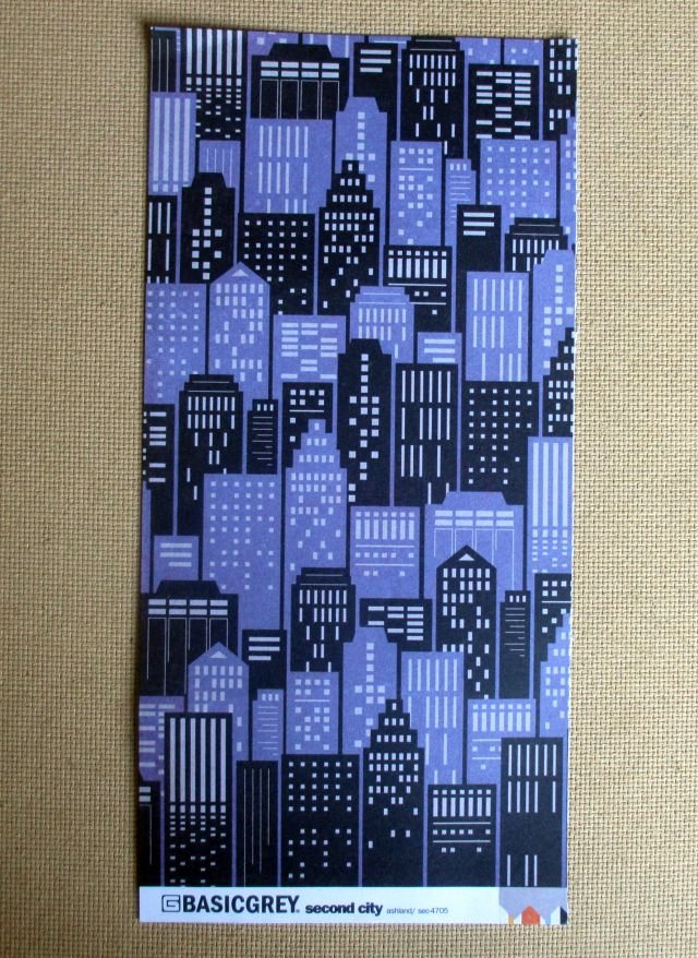
The kit I was given to forge is
Basic Grey's Second City by Kelly Purkey. It's a mostly paper kit, so I was given a list a some other items to include in my kit. But let’s see the papers first!

I was lucky to get this kit to counterfeit, I can tell you! Basic Grey was the first paper brand that I found and loved. I have lots of their old papers left, even if I've also used them faithfully. However, as I've tried to cut down my paper shopping the past year or two, the colour palettes of my old stash look very outdated. I can find a lot that fits, but getting a consistent look with such a burst of colours and patterns is a challenge.
Therefore I gave myself a sligthly higher budget than I normally would: approximately 20 €/22 USD. That allowed me to buy a few new papers and a couple of alphabet sheets!
I had just one of the Second City papers from before, called Ashland, and decided to start from there!

For more inspiration, I googled the collection name and found that Second City is a nickname for Chicago from the time when it was the second largest city of the USA. I’ve never been there, but an imaginary big city is definitely the inspiration for my kit as well.
Think vintage industrial, a town or city a bit grungy and abandoned in places, but also friendly and alive with colourful streetlife! The combination and contrast of dark and light, bold and bright is what defines my kit.
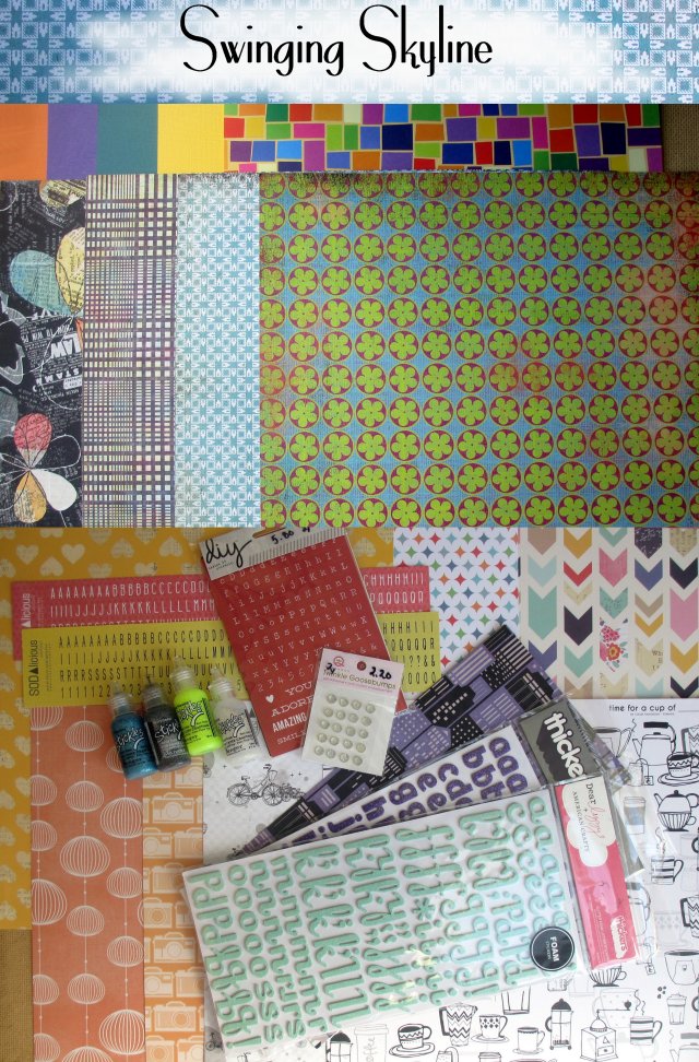
And drumroll, here is my kit:

The papers in my collection are:
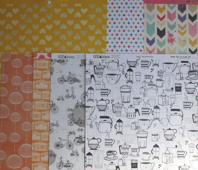
First row, left to right: Cardstock in orange, purple, teal and bright sunflower yellow and a bright coloured mosaic patterned paper, manufacturer unknown.
Second row are all Basic Grey papers, left to right: Out of Print/Reprint, Sweet Threads/Summer Wedges, Nordic Holiday/Wedge and Color Me Silly/Celebrate.
Third row: American Crafts: Lucky Charm (hearts, first on the left and arrows, last on the right) and Color Conspiracy: Everyday (in the middle).
Fourth row: Chinese Lantern patterned double sided paper in Peach/Grey, manufacturer unknown, American Crafts: Summer (cameras) and Sodalicious: Journey/I Love My Bike and Time for a Cup of/Cozy Moments.
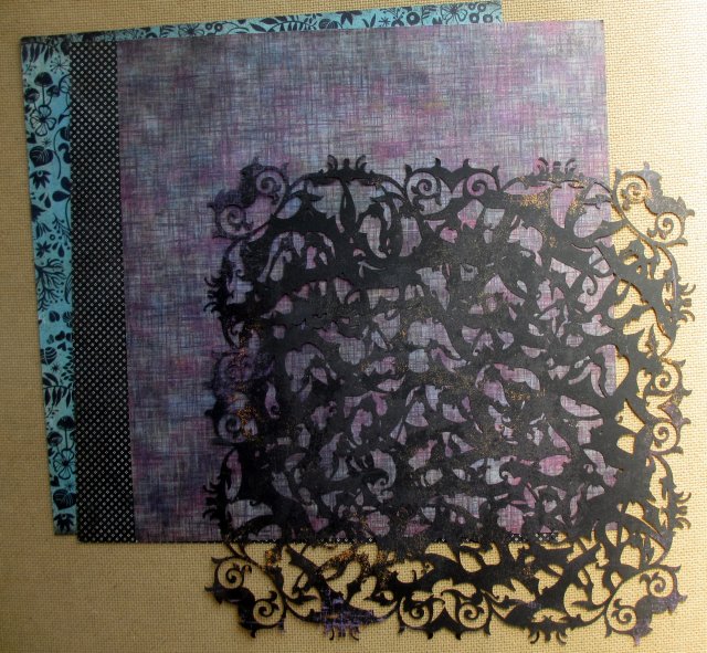
The three first BG papers are double sided. The backsides are here, from left to right: Nordic Holiday/Wedge, Out of Print/Reprint and Sweet Threads/Summer Wedges, together with a doily from the Basic Grey Eerie line, which takes takes us to a spider inhabited building at night, or maybe through old wrought iron gates or bridges!

Then again, the happy heart, arrow and lantern patterns tell the story of street festivals, with banners and lights, while the two black and white Sodalicious papers portray a bike-friendly city with lots of nice cafés to sit down at and get some artsy inspiration.

The bold colours of the cardstock are good for contrast, as they are in the original kit.
In addition to the papers...
1. Paper Choice: Second City from Basic Grey
My kit was to include the following:
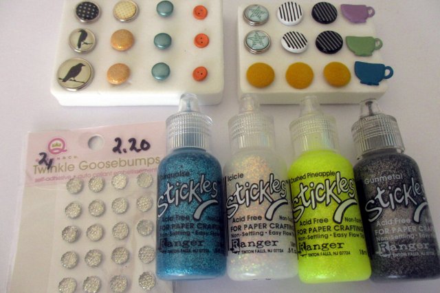
2. Tools: Glitter. My Swinging Skyline kit has four colours of Stickles glitter glue: Turquoise, Icicle, Pineapple Crush and Gunmetal, and glittery stickers called Twinkle Goosebumps.
3. Embellishments: Border strips. A couple of my papers suited well for cutting border strips, the American Crafts ones with the cameras and the colourful arrows. Washi tapes make great borders, too, so I picked a few that went along with the rest of the kit.
The yellow Sodalicious alpha look like a border in its own, and that gave me the idea to make the layout title look like a border! You'll see that in a minute...

4. Materials: Vellum. Yellow, patterned yellow, turquoise and lavender vellum – see how I used these in an embellishment down below!
5. Tiny bits: Brads (together with my Glitter selection)

6. More Embellishments: Layered embellishments
I made a large flower that combines many of my elements: it has vellum, brads and is made in layers. I fuzzy cut it from the BG Out of Print paper and added a second layer of petals cut from vellum.

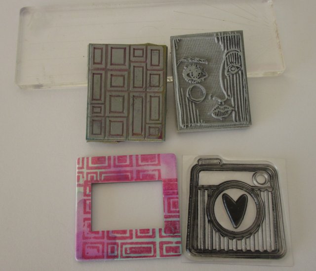
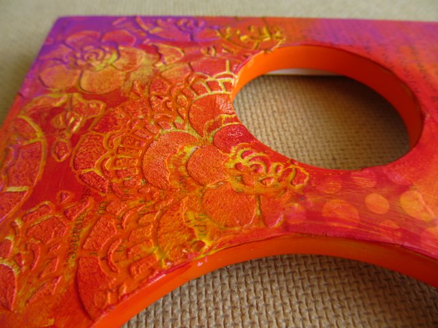
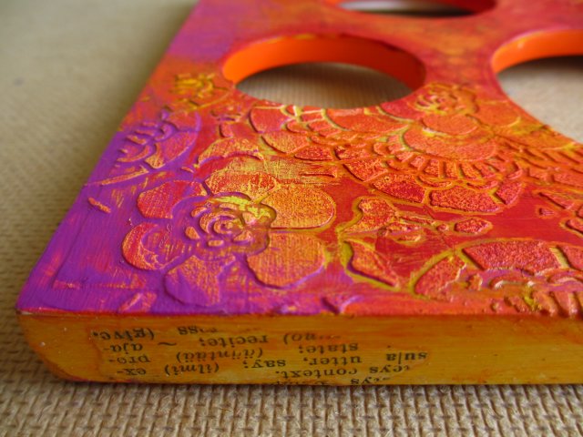
I also altered a frame with layers of alcohol inks and stamping. Here it's pictured together with a few stamps I've picked for my kit. The grey rubber ones are from 3rd Eye and the acrylic insta-heart one came with the Craft Stamper magazine.

7. Fun extras: Pocket page cards. The coffee themed Sodalicious paper, Time for a Cup of/Cozy Moments, would look great as pocket page cards, I knew it immediately! I cut half of it into 3x4 pocket cards right away. You can see one of them hiding in my layout! I run out of time before I could cut more, but I think many of these papers will look nice as pocket cards. The backsides of the Sodalicious papers and the Color Conspiracy one are neutral enough to be also used for writing the journaling on.
And now to my challenge.
I love to buy papers with bold prints and patterns, but find them too often left in my stash when their more neutral companions have already gotten into use. Anyone else have the same problem? Good news! There’s a way to use up these.
And that’s the challenge I’m giving today.

You can use gesso, paints, modeling paste, add texture by glueing cheese fabric or napkins onto the paper, or doodle, stamp, collage, or any way you like! The idea is to turn a loud background paper into more neutral and more usable. The fun pattern will not be lost but it’ll be just the first layer instead of a ready-to-use (but dominating) background.
You can probably tell why I would never have used these papers as such, let alone combine these two!

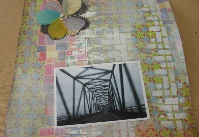
It is a good idea to start with white.

I used acrylic gesso here. You can see that where the layer is a light one, I’ve mixed gesso and water. In other parts, I’ve put a thicker layer of the gesso and used a stencil to make another layer of patterns.

My new stencil from Tando Creative was perfect with these papers, repeating the mosaic pattern!

My layout is beginning to get shape! After I got the background this far, the next things I did were the choice of photo and placing the large flower embellishment.

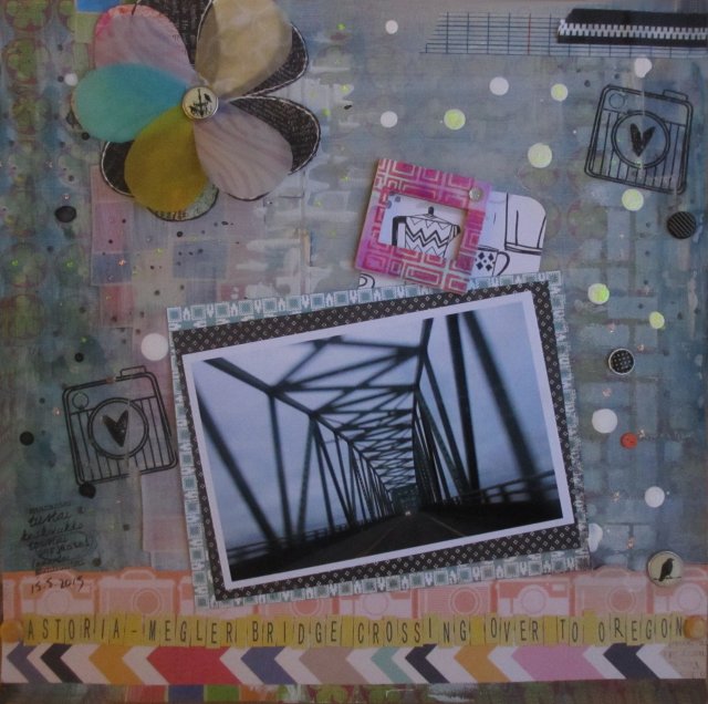
I added some paint to highlight the corners of the layout, and drops of white acrylic ink and dark grey mist here and there.
Then I matted the photo with two papers, both from BG – Nordic Holiday and the backside of Out of Print. Next thing I did was add the borders and make the title.
The Sodalicious pocket card and the altered photo frame went in their places…
Dots of Stickles, some brads and stamping, and there you are, my challenge layout!

Taking part in this DT call was a lot of fun and I can tell I'd love to join the Counterfeit Kit Challenge Team. I sure look forward to hearing from you over there!
And those of you who have never had a look at the
CKC blog, I really recommend it, those talented ladies are sharing some great ideas for using up your old stash!
 Kuva/photo by Taru Jehkonen
Paperit olivat suht lähellä omaa tyyliäni ja värimaailma murrettu, mitä usein käytän itsekin. Tällä kertaa minuun vetosi kuitenkin erityisesti paketin raikkain ja graafisin paperi, tuo Studio Calicon sahalaitakuvioinen kelta- valkoinen.
 Viime viikolla kokeilin yhtä tapaa yhdistää paljon paperisortteja leiskaan, ja nyt kokeilen toista: leikkelin papereista ikään kuin Project Life - eli taskuskräppäyskortteja. Näitä sitten asettelin lomittain kuvien kanssa, kiinnittäen ne taustapaperiin sen sijaan, että olisin sijoitellut kortit ja kuvat taskualbumiin.
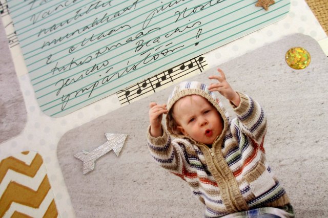 Kuvista tuli tulostusreunojen takia hiukkasen pienempiä kuin tyypillinen taskuskräppäyskortin koko 7,5x10 cm/3x4 tuumaa. Leikkasin kortit samaan kokoon.
Puukuvioihin halusin tällä kertaa jotain metalliväriä ja hopeinen väri valikoitui tähden muotoisen klemmarin mukaan. Korkkitarrat olivat myös tosi kivoja, näitä tahtoisin lisää! Tägiin tein itse leimasinmusteella vinoraitakuvion, ja muuten leiska valmistuikin mukavan nopeasti ja simppelisti, vaihteeksi ilman mitään mixed media -mömmöjä!
 Käy ihmeessä kurkkaamassa muiden tulkinnat, jos et jo käynyt:
Taru
Maikkis
Merkku
 Today's layuout is part 2 of 4 in the Scrap with the Same Materials, a swap I'm participating with three other Finnish scrapbooking colleagues. All four of us made four identical kits and mailed them to each other, and then we'll all be Scrapping with the same Materials! Last week each one posted our first layouts that were made from kits by Taru Jehkonen, aka Jehkotar, whom you might also know internationally from her Design Team and GDT duties.
 This week, everyone was scrapping with materials from Maikkis. This is a really fun idea for a group project, and you get to use different materials than you would normally choose from your stash! Do pop in at the other ladies blogs to see what they created!
Taru
Maikkis
Merkku
Thanks for your visit and happy crafting Sunday to you all!


